Choosing the right color for a master bedroom isn’t just about aesthetics, it’s about creating a space that supports rest, reflects personal style, and holds up over time. Paint is one of the most accessible DIY updates a homeowner can tackle, with a gallon covering roughly 350–400 square feet and drying within hours. But before opening that first can, it helps to understand how color choices affect mood, room dimensions, and even resale value. This guide breaks down practical master bedroom color palettes for 2026, from timeless neutrals to bold statement walls, along with execution tips to help DIYers avoid common pitfalls like color mismatch and poor prep.
Table of Contents
ToggleKey Takeaways
- Master bedroom color ideas should prioritize cool tones like blues and greens to lower heart rate and promote relaxation, while warm tones can stimulate energy and are less ideal for restful sleep.
- Test paint samples in both natural and artificial light for at least 48 hours before committing, since colors shift dramatically depending on room orientation and lighting conditions throughout the day.
- Warm neutrals, greiges, and soft taupes are 2026’s trending master bedroom color palette, offering timeless appeal that’s forgiving for DIYers and maintains resale value.
- Dark and bold colors like navy blue, forest green, and charcoal require high-quality paint with two full coats minimum and careful technique, as they show brush strokes and roller lines more readily than light shades.
- Proper surface prep—filling nail holes, sanding, and wiping walls clean—prevents paint failures and poor adhesion, making it the most critical step before applying any master bedroom color.
- Accent walls and two-tone treatments let you test bold colors with lower risk before committing to a full room repaint, especially valuable in rental homes or when tastes may shift.
Why Bedroom Color Matters More Than You Think
Wall color directly influences circadian rhythm, perceived room temperature, and even how restful sleep feels. Cool tones (blues, greens, soft grays) tend to lower heart rate and promote relaxation, while warm tones (reds, oranges, deep yellows) can stimulate energy, not ideal for a space meant for winding down.
Beyond psychology, color affects spatial perception. Lighter hues reflect more light, making small bedrooms feel larger, while darker shades absorb light and can make expansive rooms feel cozier. Sheen matters too: flat or matte finishes hide wall imperfections and reduce glare, which is why they’re standard for bedrooms. Eggshell works if walls need occasional wiping (useful in homes with kids or pets).
A third consideration: resale. Neutral palettes appeal to the broadest buyer pool, but that doesn’t mean a homeowner can’t enjoy bold color now. Just factor in an extra coat of primer and a neutral topcoat if selling within a few years. The cost to repaint a standard 12′ × 14′ bedroom runs $300–$600 in materials and labor if hiring out, or around $50–$100 in paint and supplies for a competent DIYer.
Calming Neutrals for a Timeless Retreat
Neutrals remain the backbone of home design projects for good reason: they’re forgiving, versatile, and age well. In 2026, the trend leans toward warmer neutrals, greiges, taupes, and soft off-whites, over stark white or cool gray.
Top neutral choices:
- Greige (gray + beige blend): Works with both warm and cool undertones in furniture and bedding. Test samples in natural and artificial light: some greiges skew purple or green depending on the room’s lighting.
- Warm white (with cream or ivory undertones): Classic and clean without the sterile feel of pure white. Pairs well with natural wood trim and linen textiles.
- Soft taupe: Adds subtle warmth and sophistication. Deeper taupes work in rooms with ample natural light.
Application tips:
- Always start with a bonding primer if painting over dark colors or glossy finishes. Primer seals stains and provides better topcoat adhesion.
- Use a roller with a ½-inch nap for smooth drywall. Foam rollers can leave bubbles.
- Cut in edges with a quality angled brush (2.5″ works for most trim) before rolling large sections. Wet edges blend better.
Neutrals are ideal for DIYers new to painting, they’re forgiving if the color isn’t perfectly uniform, and touch-ups blend seamlessly once cured.
Bold and Dramatic Colors for Statement Bedrooms
For homeowners who want personality over placid, deep jewel tones and saturated hues create impact. These colors work best in bedrooms with good natural light or well-planned artificial lighting, since dark walls absorb lumens.
Popular bold choices in 2026:
- Navy blue: Timeless, elegant, and surprisingly calming. Navy grounds a room and pairs well with brass fixtures and white bedding. Designers often showcase rich color palettes that incorporate navy as a foundational shade.
- Forest green: Brings an organic, grounding vibe. Works especially well in rooms with wood furniture or botanical prints.
- Charcoal or slate gray: Modern and moody without going full black. Charcoal reads differently depending on undertones (blue-gray vs. warm gray), so test samples.
- Terracotta or burnt orange: Warm, earthy, and trending. Best suited to rooms with cooler light exposure (north-facing windows) to balance the warmth.
Execution notes:
- Dark colors show roller lines and brush strokes more readily than light ones. Use a high-quality paint (look for paints with higher solids content) and apply two full coats minimum.
- Tape trim carefully with painter’s tape rated for delicate surfaces. Remove tape while the final coat is still slightly tacky to avoid peeling dried paint.
- Consider an accent wall first (see next section) if commitment to a full room feels risky. Dark colors typically require a gallon per 300 square feet instead of the usual 400, due to higher pigment loads and the need for even coverage.
Bold colors aren’t more difficult to apply than neutrals, they just require more attention to technique and lighting.
Soft Pastels and Earthy Tones for Serene Spaces
Soft pastels and muted earth tones hit a sweet spot: visually interesting but still restful. These shades work well in bedrooms that receive lots of natural light, where bolder colors might feel overwhelming.
Trending soft tones:
- Dusty rose or blush pink: No longer just for nurseries. Muted pinks add warmth without reading overly feminine, especially when paired with dark wood or metal accents.
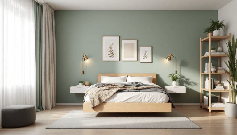
- Sage green: Subtle, organic, and incredibly popular in 2026. Sage pairs beautifully with linen, rattan, and white trim. Many home decorating guides feature sage as a go-to for tranquil bedrooms.
- Powder blue: Light and airy. Works in both traditional and coastal-inspired bedrooms.
- Clay or terracotta (muted versions): Earthy without being dark. These shades feel grounded and warm, ideal for southwest or boho aesthetics.
- Warm beige with pink undertones: Softer than traditional beige, with just enough color to avoid blandness.
Practical considerations:
- Pastels can show roller texture more than deeper colors. Use consistent pressure and a quality roller cover.
- Some pastels, especially blues and greens, shift tone dramatically depending on lighting. Paint a 2′ × 2′ test section on at least two walls (one with natural light, one without) and observe at different times of day.
- Pair soft wall colors with contrasting trim (white or off-white trim brightens pastels) or go tonal for a more enveloping look.
These colors are forgiving for beginners and easy to touch up, making them solid choices for DIYers tackling a first bedroom repaint.
Two-Tone and Accent Wall Ideas
Accent walls and two-tone treatments add visual interest without overwhelming a space. They’re also a low-risk way to test a bold color before committing to four walls.
Accent wall strategies:
- Behind the headboard: The most common placement. Draws the eye to the bed and creates a natural focal point.
- Opposite the bed: Works if there’s architectural interest (a fireplace, large window, or built-in shelving).
- Horizontal color blocking: Paint the lower third or half of all walls in a darker shade, the upper portion in a lighter shade. This can visually lower a tall ceiling or add dimension to a boxy room. Use a laser level to mark a straight line: chalk lines can bleed under tape.
Two-tone execution tips:
- Paint the lighter color first on all walls and let it cure fully (24–48 hours).
- Measure and mark the division line. For horizontal blocking, a line 32″–36″ from the floor mimics chair rail height and feels proportional in most bedrooms.
- Apply painter’s tape along the line, pressing edges firmly with a putty knife to prevent bleed-through.
- Paint the darker color. Remove tape while paint is still slightly wet.
Complementary combinations:
- Soft white + deep navy
- Warm gray + terracotta
- Cream + sage green
- Greige + charcoal
Accent walls work especially well in rental homes where a full repaint may not be feasible. Resources like modern decor platforms often highlight creative accent wall approaches in contemporary bedrooms. One bold wall is also easier to repaint when tastes change, just two coats of primer and a neutral topcoat, rather than a full room refresh.
How to Choose the Right Color for Your Master Bedroom
Selecting a bedroom color involves more than flipping through a fan deck. Start with these practical factors:
1. Assess natural light. North-facing rooms receive cooler, indirect light and benefit from warm tones. South-facing rooms get intense, warm light and can handle cooler shades or even dark colors without feeling cave-like. East- and west-facing rooms shift throughout the day, test samples at morning, midday, and evening.
2. Consider existing elements. Carpet, bedding, furniture, and trim all influence how wall color reads. If replacing these isn’t in the budget, choose a paint color that works with what’s staying. For example, honey oak trim (common in homes built in the ’80s and ’90s) pairs better with warm neutrals or greens than cool grays.
3. Factor in ceiling height and room size. Light colors and cool tones make small rooms feel larger. Darker colors add coziness but can shrink a space visually. In rooms with ceilings over 9 feet, a darker wall color can actually improve proportions.
4. Test before committing. Buy sample pots (usually 8 oz. for around $5 each) and paint poster board or directly on the wall. Live with samples for at least 48 hours and check them in different lighting conditions.
5. Mind the sheen. Flat and matte finishes are standard for bedrooms, no glare, easier to touch up. Eggshell is slightly more durable and washable. Avoid satin or semi-gloss on walls unless there’s a specific need (high humidity, frequent cleaning).
6. Don’t skip prep. Most DIY paint failures come from poor surface prep. Fill nail holes with lightweight spackling compound, sand smooth once dry, then prime any patched areas. Wipe walls with a damp cloth to remove dust before priming or painting. Skipping this step causes poor adhesion and visible imperfections.
Safety and PPE: Use a respirator mask rated for VOCs if painting with oil-based or high-VOC paints, especially in poorly ventilated spaces. Low-VOC and zero-VOC latex paints are widely available and safer for occupied homes. Wear safety glasses if cutting in near the ceiling (drips happen), and keep the room ventilated with fans or open windows.
Conclusion
Color sets the tone for a master bedroom, literally. Whether choosing a soothing neutral, a bold jewel tone, or a soft pastel, the key is thoughtful selection and solid execution. Test samples, prep surfaces properly, and don’t rush the process. With the right color and a little DIY know-how, a bedroom can shift from functional to genuinely restful in a weekend.